
Color is one of the easiest ways to transform a room — but picking the right accent color can feel like a design gamble. Go too bold, and it overpowers the space. Play it too safe, and the room feels flat. The secret lies in finding the perfect pop of color that complements your main palette and enhances your home’s personality.
Let’s explore how to confidently choose accent colors that pop without throwing off your entire design vibe.
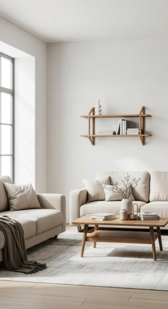
Start with a Neutral or Base Palette
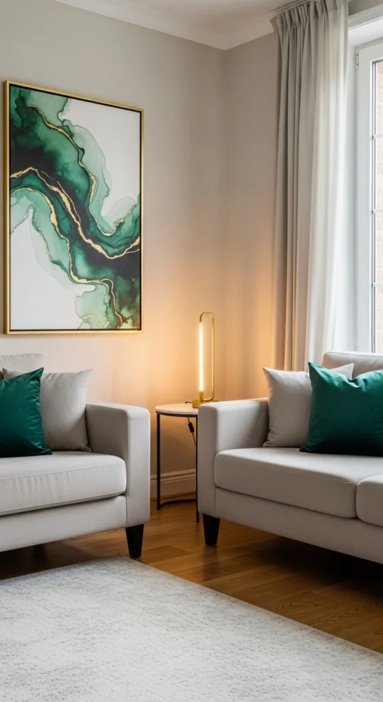
Before adding any accent colors, establish your base. Think of this as your room’s foundation — typically 60–70% of your color scheme. Neutrals like white, beige, gray, taupe, or soft greige work best because they make accent colors stand out beautifully.
Base palette ideas:
- Warm base: Cream walls, tan furniture, and gold-toned accents.
- Cool base: Light gray walls with charcoal furniture and black frames.
- Minimalist base: Crisp white and natural wood tones.
Once your base is calm and consistent, you can confidently layer in colors that bring energy and contrast.
Use the 60-30-10 Rule
This timeless design formula helps maintain balance no matter how colorful you go.
- 60% – Main color (walls, large furniture).
- 30% – Secondary color (curtains, rugs, mid-size accents).
- 10% – Accent color (pillows, artwork, vases, or decor pieces).
For example: A light gray living room (60%) with navy curtains (30%) and mustard yellow cushions (10%) instantly feels stylish and intentional.
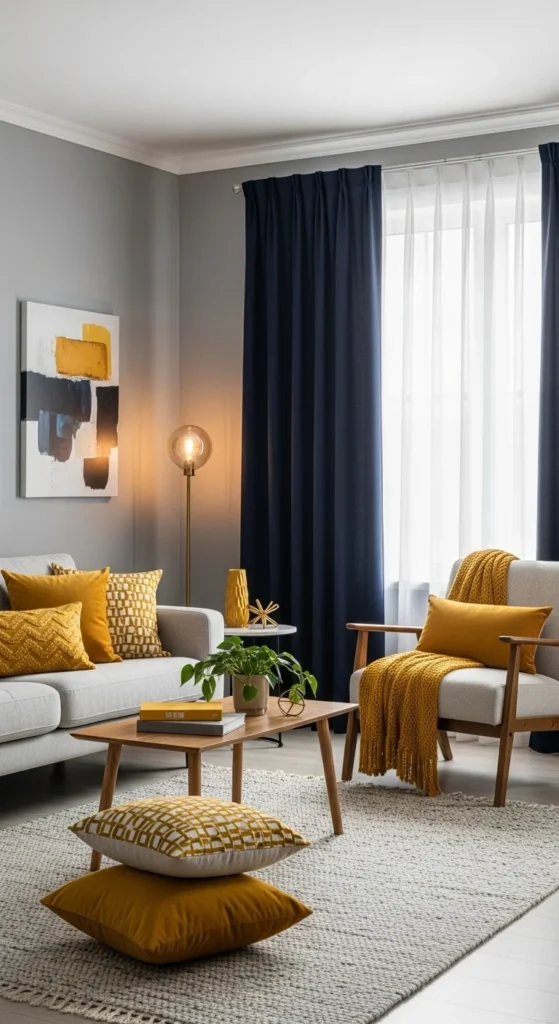
Sticking to this ratio keeps your pops of color balanced and visually pleasing instead of overwhelming.
Find Inspiration from Your Existing Decor
If you’re unsure where to start, look around — inspiration often hides in what you already own.
Ideas to spark color direction:
- Pull shades from your artwork or rug patterns.
- Notice tones in your wood finishes or metals.
- Let nature guide you — greens, blues, and earthy terracotta never go out of style.
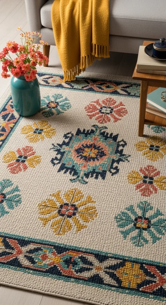
This approach ensures your color choices feel cohesive with your existing design rather than forced.
Choose the Right Type of Accent Color
Different accent colors evoke different moods. The trick is to pick one that fits the feeling you want in the space.
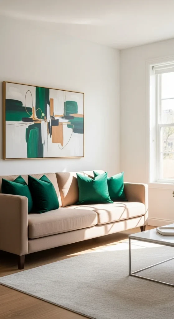
Warm tones (reds, oranges, yellows): Energizing and cozy. Great for living rooms and kitchens.
Cool tones (blues, greens, purples): Calming and relaxing. Perfect for bedrooms and bathrooms.
Metallics (gold, brass, silver): Add luxury and depth without overwhelming.
You can also explore unexpected accents like deep teal, blush pink, or olive green — trendy yet timeless when used sparingly.
Test Before You Commit
Lighting changes how color appears — what looks vibrant in the store can feel dull or harsh at home. Always test before making big decisions.
How to test smartly:
- Paint a small swatch on your wall and observe it in morning, afternoon, and evening light.
- Hold accent items (pillows, throws, or artwork) near your furniture to see if tones complement each other.
- Use digital design apps or mood boards to visualize combinations before purchasing.
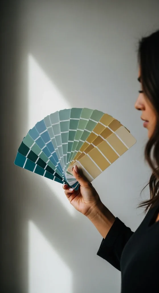
Small samples can prevent costly mistakes and give you confidence in your color pairing.
Layer Accents Across the Room
Instead of concentrating color in one spot, repeat it in small doses across the space. This repetition creates flow and harmony.
Ways to distribute accent colors:
- Add pillows, candles, or planters in the same hue.
- Repeat your accent tone in wall art or textiles like rugs and throws.
- Use similar shades in books, ceramics, or small decorative items.
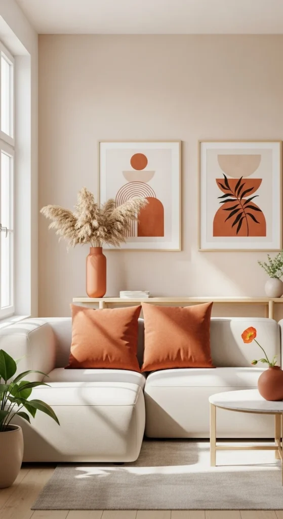
This layering trick makes your accent color feel intentional and well-balanced — like a designer touched every detail.
Don’t Forget Texture and Finish
Sometimes it’s not just the color, but the finish that makes it pop. Glossy, matte, or textured materials can change how your accent colors interact with light.
Design-savvy tips:
- Use velvet or suede cushions for richer tones.
- Add ceramic vases or metallic lamps for subtle reflection.
- Mix materials like wood, glass, and metal to add depth to your palette.
Texture can make even muted colors feel dynamic, adding sophistication without relying on brightness alone.
The Final Touch
Choosing accent colors that pop is part art, part intuition — but mostly balance. When your base palette is calm, your accents can shine confidently without stealing the spotlight.
Experiment with swatches, use color in layers, and trust your instincts. The right accent color will make your space feel alive, personal, and perfectly curated.
Leave a Reply