
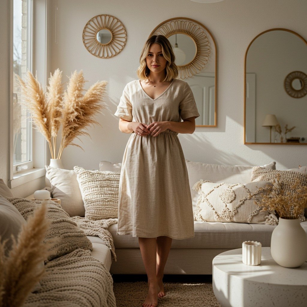
Picking the right wall color can feel overwhelming—one shade too dark, and your space feels small; too light, and it looks washed out. The truth is, wall color is the single most powerful (and affordable) way to change the mood of a room. With the right choice, you can make a space feel larger, cozier, or instantly more stylish
Step 1: Understand the Mood You Want
Before reaching for the paint swatches, think about the vibe you want the room to give off.
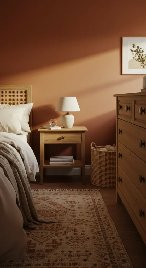
- Cozy & Warm → earthy tones like terracotta, beige, or olive green.
- Bright & Airy → soft neutrals like ivory, light gray, or pale blue.
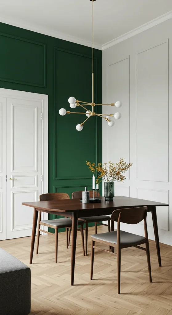
- Dramatic & Bold → jewel tones like emerald, sapphire, or charcoal.
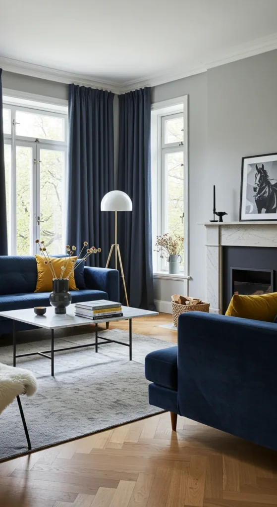
- Elegant & Classic → timeless shades like navy, greige, or taupe.
Your walls set the stage for everything else, so let mood be your guide.
Step 2: Pay Attention to Natural Light
Lighting changes how paint looks—dramatically. A color that looks dreamy in the store might feel completely different at home.
- North-facing rooms get cooler light, so warmer tones help balance.
- South-facing rooms are full of warm light, so cooler tones work beautifully.
- East-facing rooms glow in the morning, making soft pastels shine.
- West-facing rooms are warm at sunset—perfect for deeper, dramatic colors.
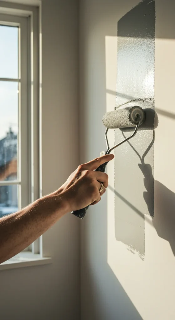
Pro tip: Always test a sample on your wall and check it at different times of day.
Step 3: Use the 60-30-10 Rule
Designers swear by this simple trick for creating balance:
- 60% → Dominant wall color (your main shade).
- 30% → Secondary color (furniture, curtains, or an accent wall).
- 10% → Accent color (pillows, rugs, artwork, or decor).
This rule ensures your space looks put-together instead of chaotic.
Step 4: Consider Room Size and Shape
Colors can visually change the proportions of your space:
- Small rooms → Light, soft shades make them feel bigger and brighter.
- Large rooms → Darker tones add coziness and drama.
- Low ceilings → Paint them lighter than the walls to make the room feel taller.
- Long, narrow rooms → Use a darker shade on the shorter walls to balance proportions.
Paint isn’t just color—it’s a clever design tool.
Step 5: Don’t Forget Undertones
This is where many people go wrong. A gray might have blue, green, or purple undertones that completely shift the vibe.
- Warm undertones (yellow, red, orange) = cozy and inviting.
- Cool undertones (blue, green, purple) = crisp and refreshing.
- Neutral undertones = versatile and timeless.
Always compare swatches against your flooring, furniture, and fabrics before committing.
Step 6: Try an Accent Wall or Two-Tone Look
If painting the whole room feels intimidating, start small:
- Accent walls → Choose one wall in a bold or darker shade.
- Two-tone walls → Paint the bottom half darker and the top half lighter, separated with trim or molding.
- Color blocking → Use bold shapes or stripes for a playful effect.
This adds character without overwhelming the space.
Step 7: Test Before You Commit
Never skip the sample stage. Buy small sample pots and paint large patches directly on your walls. Watch how they look in daylight, lamplight, and at night.
Sometimes the color you thought you loved in the store ends up too bright, too dull, or too different once it’s actually on the wall. Testing avoids regret—and extra paint jobs.
Takeaway
Choosing wall colors isn’t just about picking a pretty shade—it’s about creating a mood, balancing light, and shaping how your space feels. Start with the mood, test with samples, and don’t be afraid to play with accents. The right color can completely transform your room—without changing a single piece of furniture.
Leave a Reply